
Communication Design
Branding & Identity
New Brand Identity > Micro, Small & Medium Enterprise
COMMUNICATION DESIGN - Branding & Identity (New Brand Identity > Micro, Small & Medium Enterprise)
 PNG
 PDF
The Croffle Guys
Brand: The Croffle Guys
Client: The Croffle Guys
Entrant: Erth Co.
The First List
| Entry Title: | The Croffle Guys |
|---|---|
| Brand: | The Croffle Guys |
| Client: | The Croffle Guys |
| Entrant Company: | Erth Co. |
| Yes: | Packaging: Tray, Sleeve, Cup Print: Menu Merchandise: Tshirt |
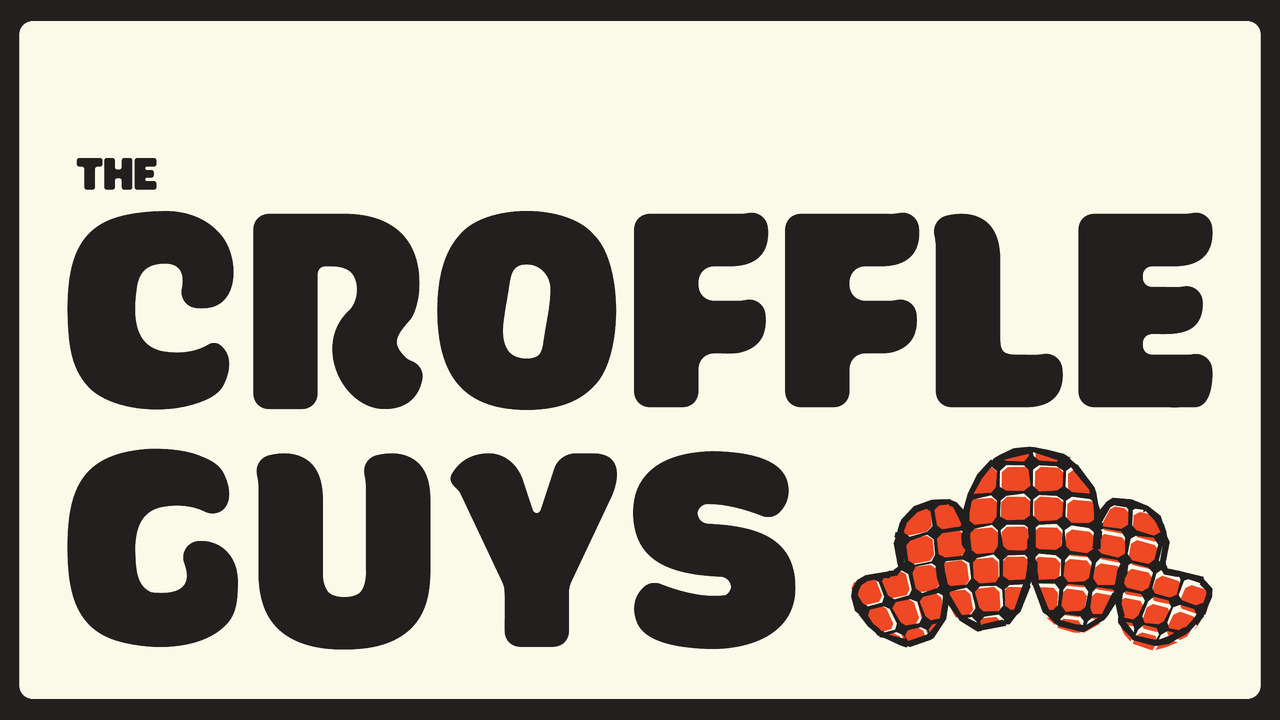
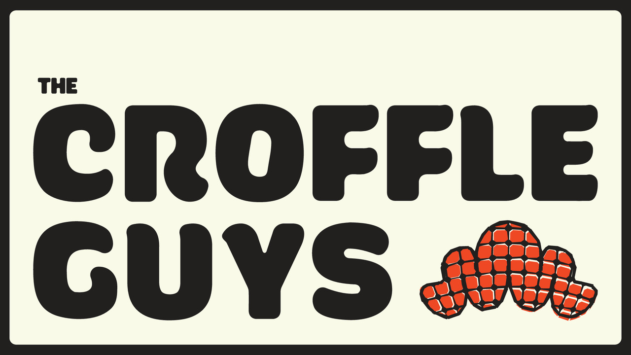
| Description: | Croffles aren’t part of India’s culinary vocabulary. Not yet. Not quite croissant, not quite waffle, they straddle a strange, delicious middle. And in a culture where food is deeply nostalgic, branding something without precedent meant building familiarity from scratch. The identity works like a cognitive shortcut, introducing, explaining, and appetising in one go. A mirrored C and G bracket the logotype like structural bookends. Typography is plump, soft, and bite-worthy. The colour palette with a deep black and vivid orange channels Indian street food energy while visually coding sweet and savoury and speed and indulgence. The packaging is photogenic, functional, and fast to scan. Menus are structured like scrollable feeds, built for modern attention spans. The founders appear as illustrated characters, anchoring voice and familiarity. This brand system is designed to launch a product category, not just a product. It's functional, fast, and fun, relying on clarity, wit, and visual recall to build memory where there was none. |
| Individual Credits: | Malvika Ruparel |
| Individual Credits: | Roshni Jain |
| Individual Credits: | Tanvi Pahuja |
| Individual Credits: | Jeevika Dasani |
| Individual Credits: | Abdeali Saifee |
