
Communication Design
Branding & Identity
New Brand Identity > Micro, Small & Medium Enterprise
COMMUNICATION DESIGN - Branding & Identity (New Brand Identity > Micro, Small & Medium Enterprise)
 JPG
 PDF
 MP4
1m:48s
Renting Out Seasons
Brand: Apple & Eve
Client: Apple & Eve
Entrant: Studio EBBXFLO
The First List
| Entry Title: | Renting Out Seasons |
|---|---|
| Brand: | Apple & Eve |
| Client: | Apple & Eve |
| Entrant Company: | Studio EBBXFLO |
| Yes: | APPLE & EVE BRAND BOARD |
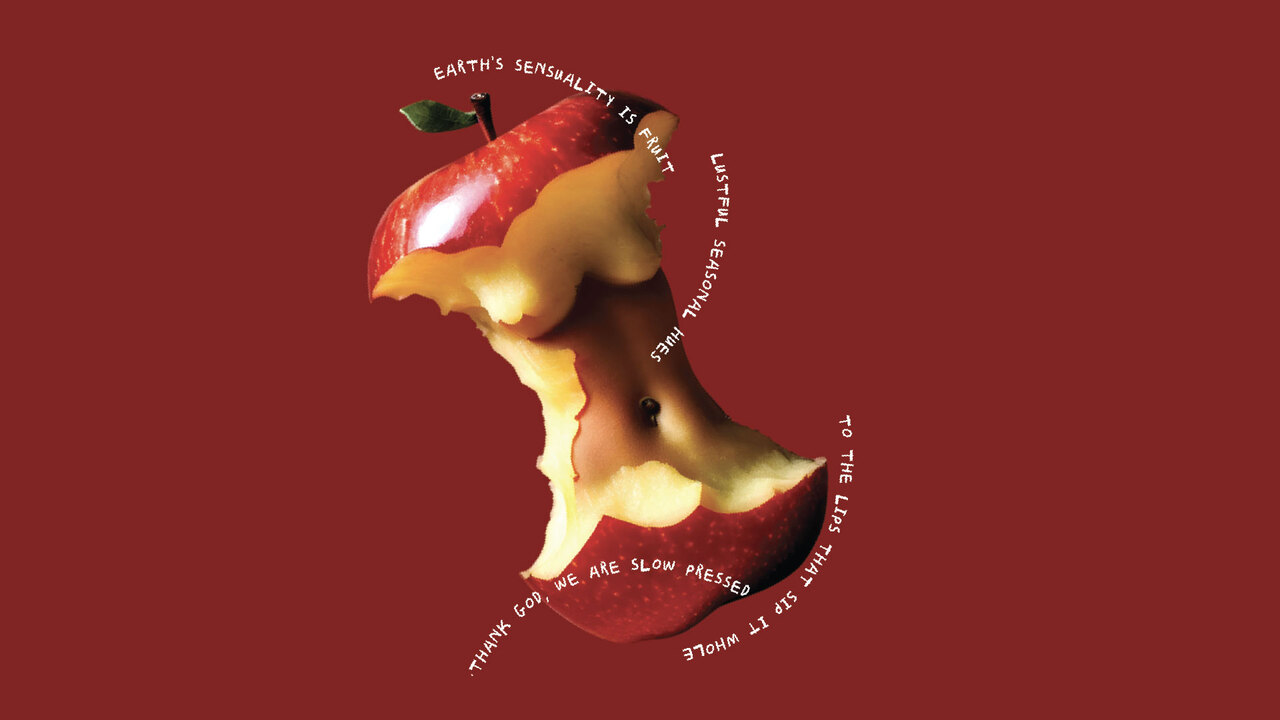
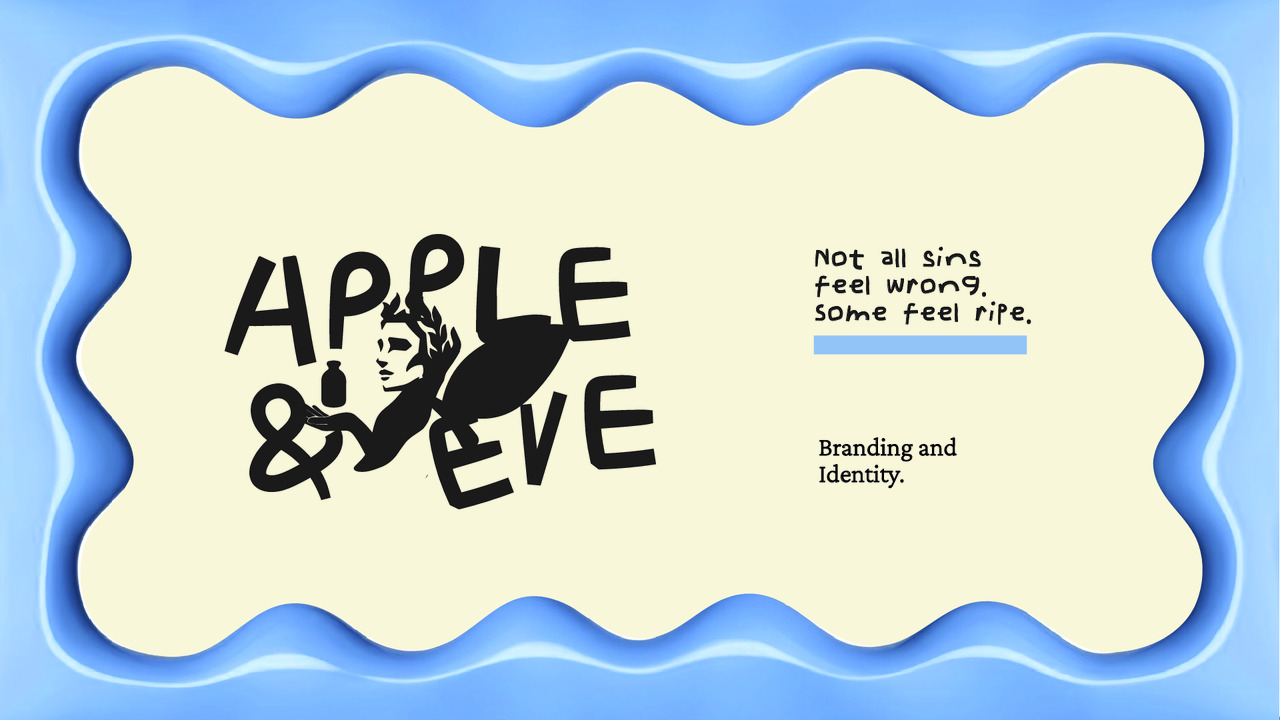
| Description: | Apple and Eve is a fruit-blend microbrand that reimagines indulgence as a modern ritual - not a sin, but a blessing. The brand identity is built on a singular idea: “Pressed, but blessed.” Every element, from the logo to the packaging, carries a sense of divine mischief, analog charm, and fruit-forward storytelling. The brand world blends Wes Anderson symmetry with vintage market signage, resulting in a soft, sun-drenched aesthetic edged with wit. At its core is a visual pun — a logo that evokes a mock-sacred gesture, Eve offering juice not as temptation, but invitation. Typography is hand-cut and irregular, resisting perfection in favor of emotional texture. The identity system features 3D wavy shapes inspired by juice labels and childhood lunchboxes, turning packaging into playful totems of taste. A custom art system was developed for every blend — Pure Lemon, ABC, and more — showing fruits mid-transformation, each housed in a bottle form from a different era. Even the brand patterns are born from the remains - peels, rinds, and scraps reimagined into texture. Apple and Eve celebrates what’s left behind just as much as what’s bottled, designing a microbrand identity with surprising depth, flexibility, and memory. |
| Individual Credits: | Akash Kumawat |
| Individual Credits: | Anusha Tallam |
