
Communication Design
Branding & Identity
Brand Identity Refresh > B2B
COMMUNICATION DESIGN - Branding & Identity (Brand Identity Refresh > B2B)
 PNG
 MP4
1m:26s
Netar Re-branding
Brand: Netar
Client: Netar
Entrant: Acumen Creative Studio Private Limited
The First List
| Entry Title: | Netar Re-branding |
|---|---|
| Brand: | Netar |
| Client: | Netar |
| Entrant Company: | Acumen Creative Studio Private Limited |
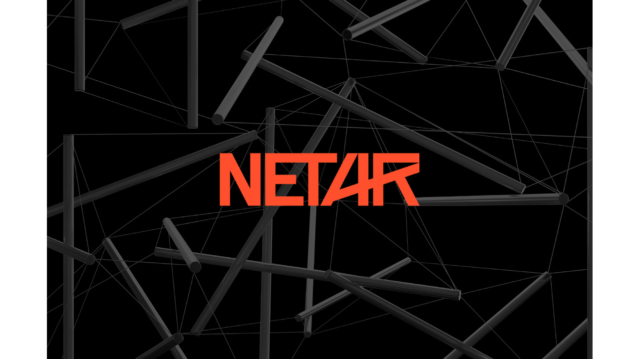
| Description: | Netar’s new identity was built on the idea of making the unseen world of enterprise connectivity visible. We began with a custom wordmark, structured with angular precision to mirror the brand’s focus on intelligence, security, and scale. The architecture of enterprises gave us the symbolism of lines that extend beyond form, symbolising networks, infrastructure, and the constant motion of evolving technology. The colours played a defining role, with orange bringing in the spark of innovation and forward momentum, while deep greys and blacks grounded the brand in clarity and authority. The choice of a clean sans serif typeface gave the identity its confident voice, balancing modernity with trust. From there, the system grew into a scalable visual language. Geometric frameworks and connective motifs provided a rhythm that could adapt seamlessly across touchpoints, ensuring the brand always looked consistent yet alive. The result is a living identity that feels as progressive and intelligent as Netar’s vision, one that represents the brand, while also progressing with it. |
| Company Credits: | Acumen Creative Studio Private Limited |
| Individual Credits: | Creative Strategy & Copy: Surjeet Chaudhary |
| Individual Credits: | Creative Design: Yash Prajapati |
